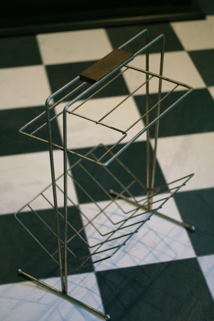
Stuff you just won’t see in today’s magazines

My dad (who always has a bead on some old bound magazine collections on eBay) recently snagged a bound collection of 1950 House Beautiful magazines.  Oh, it is so much fun to go through these — not only to see all the style elements that I love about the architecture and design from this time period — but it is also fun to see some old products and ads that just don’t exist anymore.   Some of the products are funny because they were considered rather taboo and the carefully-worded text is designed not to offend the most delicate sensibilities.  Some of the ads are just downright inappropriate because it’s not even trying to hide the racism behind them.

Case in point:
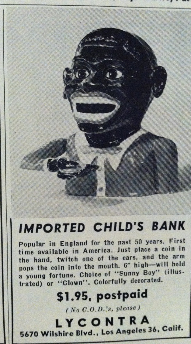
There’s just no way that you can call something “Sonny Boy” and make a “bank” like this without it being totally racist. I do, however, wonder how scary the clown bank looked.  Hello, nightmares!
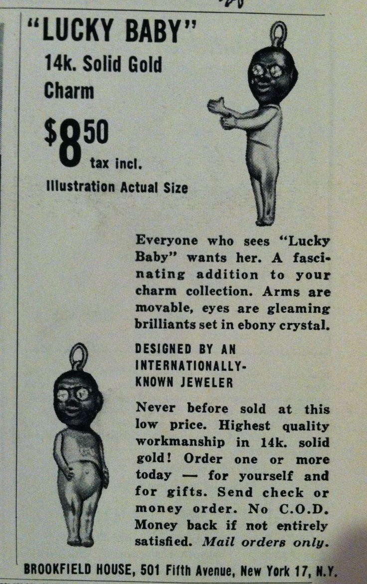
What the …. ?  What IS this?  How is it a good luck charm?  How will I be able to sleep without those scary jeweled eyes invading my dreams?  Egads!

Over time copywriters have learned that there are just certain words and terms that you don’t put into a headline together unless you want people to look twice.  Back in 1950, however, this made perfect sense:
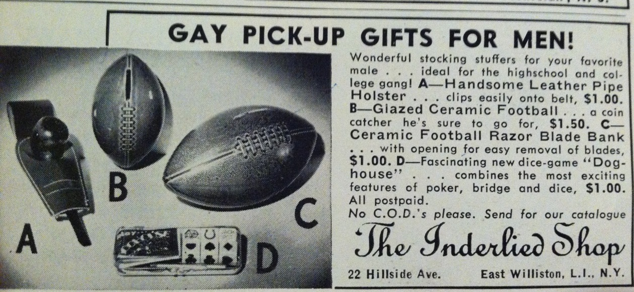
When they weren’t coaxing readers to find “gay pick-up gifts for men,” the 1957 Sears catalog was then anxious to make women feel shameful about their natural body functions.  Be dainty!  Get one of these!
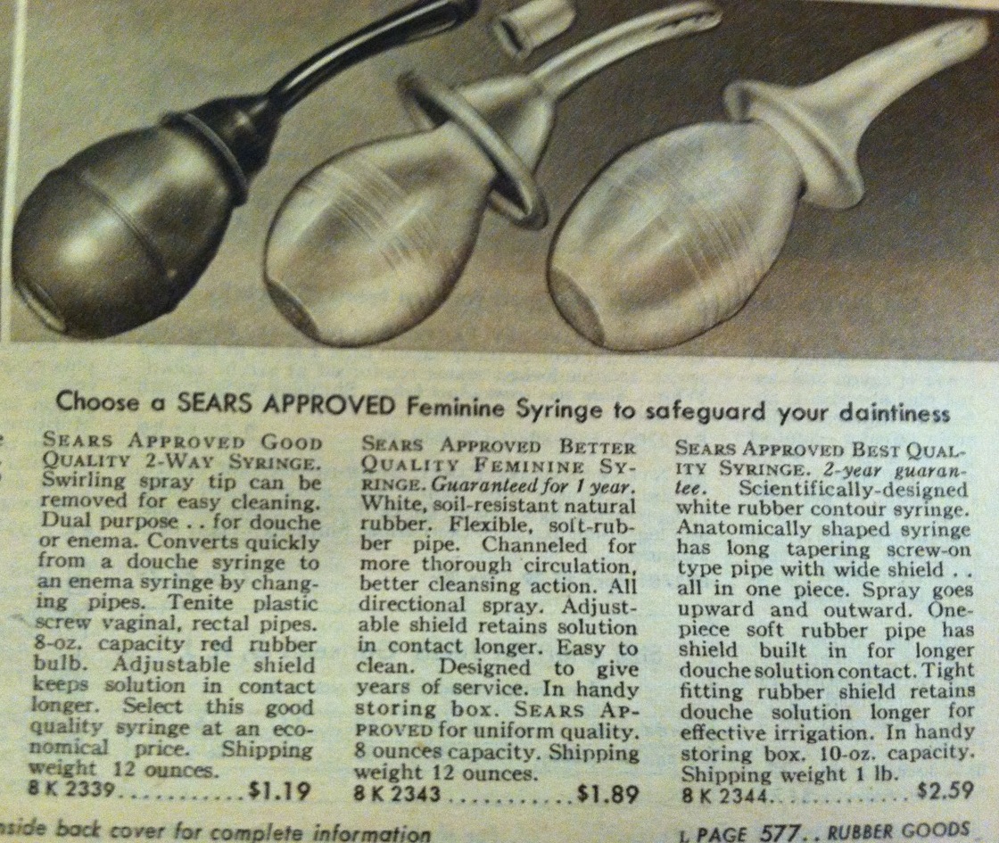
Sears catalogs are quite a hoot, mainly for the vast array of things that they offered via their catalog that you just don’t see anymore.

More to come as I continue to peruse these catalogs and magazines.  Summer’s almost over and I’m working on getting all my traveling in so that I can pretend that school isn’t starting back up again.

(It’s not working very well.)



Share

1954 Miller Studios Fish

Yep — chalkware fish are still on my mind.  Kind of makes you wish you had my life, eh?  Nuttin’ but chalkware fish using up my brain cells.

These fish are more special to me than the ones I posted about previously.  These have been in storage since the late ’90s.  They’ve been through four moves with me since that time, including the past ten years in my current house.  I never wanted to hang them up, though, because they never seemed to fit — either in theme or in color.  I was never in the apartments of my youth long enough to even think about unpacking these delightful fish, and it only took me, uh, ten years to strip off the ugly basket-n-bunnies wallpaper in our bathroom, where these fish now live.  Now that the walls are a nice, calm, “bathroom blue,” the fish can now come out and play.  They were an afterthought, however, because I originally hung up the blue fish that I talked about in my previous post.  Once those were up, I felt inclined to hang up these fish as well, even though they don’t really fit in with the other colors of the bathroom.

These two fish were given to me by my grandmother, who had them hanging in the bathroom of her lake cabin.  When I was a little girl, I used to love the fish.  They had become indelible part of the lake cabin — always there, always in the same spot.  The last time I visited the cabin in 1997, I felt sorely disappointed when I went into the bathroom and realized that the fish were gone.  My grandparents were in the process of selling their cabin that year and were slowly taking down decorations here and there for storage.  Several months later, my grandmother surprised me by presenting me with the fish during a visit, remembering how shocked I was that they weren’t on the wall during my last visit up there.

And so the fish have traveled many roads with me — literally and figuratively.  I had never really looked closely at the fish before, since my penchant for retro didn’t truly start emerging until a few years ago.  While hanging the fish up the other week, I noticed that they’re actually signed and dated: 1954, Miller Studios.

Given the fact that my little ranch house was built in 1953, I’m thinking the husband and wife truly feel at home.  🙂

Share

The stand

I got the stand that I wrote about in my last post.  🙂

It’s in rough shape and will need to be repainted, as most of the gold paint has flaked off or is corroding off. Note the subtle difference between this stand and the one I found on Etsy last week that I posted about:

The only difference seems to be in the lay of the lines going up the side.  I happen to like mine better, but it’s curious as to how two products would exist with such a minimal difference between them.

Looking at this stand, I wonder a couple things.  Obviously the bottom is used for newspapers or magazines.  But what about the top rack?  The wide spaces between the bars makes it impractical for what you’d think it’d be for — holding cigarette packages or other smoking paraphernalia, keeping them close to the ash tray.  However, I’d think it’d also be impractical for holding things like magazines or a telephone book, because really — who’d want paper products right next to the place where ashes would be flicked?  The top rack is an enigma, for now. Any opinions as to what to use it for?  Anyone have one of these stands in their house “back in the day”?

More importantly, does anyone have a rectangular ash tray measuring 5 5/8″ x 7 3/4″?   Because, you know, I’m starting to feel like the search for this ash tray (one that has already commenced) is going to be akin to finding that good old needle in a haystack.  Or finding the perfect shade of red lipstick.  I’m still working on that one.

Share

Going retro without going overboard: countertops

When I made the decision to create a retro kitchen (for now . . . the rest of the house may follow), I struggled with the knowledge that while I loved the retro look, a potential home buyer may not.  We’ve been in our house for ten years, but that certainly didn’t mean that if the perfect house came up for sale on an acreage somewhere near us that I wouldn’t drop everything to go buy it.
Continue reading “Going retro without going overboard: countertops”

Share

The Charming Woman

As I mentioned in my last post, I bought a booklet on Etsy the other day whose title made me snap it right up: The Charming Woman, published in 1957. Although I didn’t realize it at the time, this must have been one of a string of publications, because there are others referenced just inside the cover, and the articles within also refer to “so-and-so’s article on hats” and the like. Regardless of not having the whole set, this one booklet is an interesting glimpse into the past.
Continue reading “The Charming Woman”

Share

Diggin’ out and checkin’ in

Oh, it’s been a busy couple of weeks!  Semester tests occurred the last 3 days before Christmas break started, and then as the break grew closer, we in the Midwest became aware of a humungous snowstorm that was headed our way — the worst one in years, the chatter among the locals said.  Indeed, as December 22 came upon us, it was painfully evident that yes, there was a storm on the way and that traveling might be a wee bit tricky.  Freezing rain occurred on the 22nd, making things interesting right off the bat, but we knew more was coming.  Lots more.
Continue reading “Diggin’ out and checkin’ in”

Share