After my last post, I decided to scan in the Hilex catalog and something I picked up a couple months ago, a House Party Book sponsored by Webcor.
If you’d like to peruse them, here is the Hilex catalog, and here is the House Party Book.
Enjoy!

Lovin' the shiny and the retro
After my last post, I decided to scan in the Hilex catalog and something I picked up a couple months ago, a House Party Book sponsored by Webcor.
If you’d like to peruse them, here is the Hilex catalog, and here is the House Party Book.
Enjoy!
I have almost been back at school for a month now, and it seems surreal. After last year, which was chaotic and stressful and, therefore, not much remembered since I was in survival mode, I was determined to return to school this year with renewed energy and a positive spirit. And, for the most part, I have. I’m trying really hard not to let the few challenging students drag down my entire day, but this year I’ve been handed a couple challenging CLASSES – where a majority of the kids are super high maintenance. I’m not going to lie and say that I don’t dread those days a little bit. I have already categorized my odd day schedule as the “difficult” one and my even day schedule as my “easy” one. The odd day schedule is indeed tiring; I teach straight through with my only break being 40 minutes of lunch. From 8:15 to 12:10 I am working with students and teaching; then from 12:50 until 3:25 I’m back at it. I know people will point out that hey, I get done at 3:25! Yes, but then it’s sitting there grading and planning for upcoming days. I’m not complaining. Some years are just challenging for the energy they require from an introvert teacher, and this is one of those challenging years.
My husband and I were in La Crosse, Wisconsin, last weekend for the Elvis Explosion festival that occurs there every year. In fact, that is where we were last year when my husband ended up in the ICU with sepsis. It was a little strange to be back there in that environment, remembering the emotions that I was going through the last time I was there. I had felt like the rug had been yanked out from under me in a very violent way, and I remember wandering around feeling very lost and confused.
This year, however, we had a great experience and my husband drummed like a rock star, as always. My family was able to be up there as well, so that made it extra special. The only unfortunate thing about that weekend is not really having a lot of time to enjoy La Crosse, which is such a beautiful area with a vibrant downtown atmosphere. There’s an antique store that we love to visit there that has 3 floors of goodies. We were able to go there with my family and I kind of made a haul.
First, I found a catalog full of cookbooks from Good Housekeeping. It came in a little green binder so that people could insert them as they bought them. The binder was falling apart and missing the back of it, so I threw that away and took all the cookbooks out. These are such fun with goofy retro graphics and fantastic fonts:
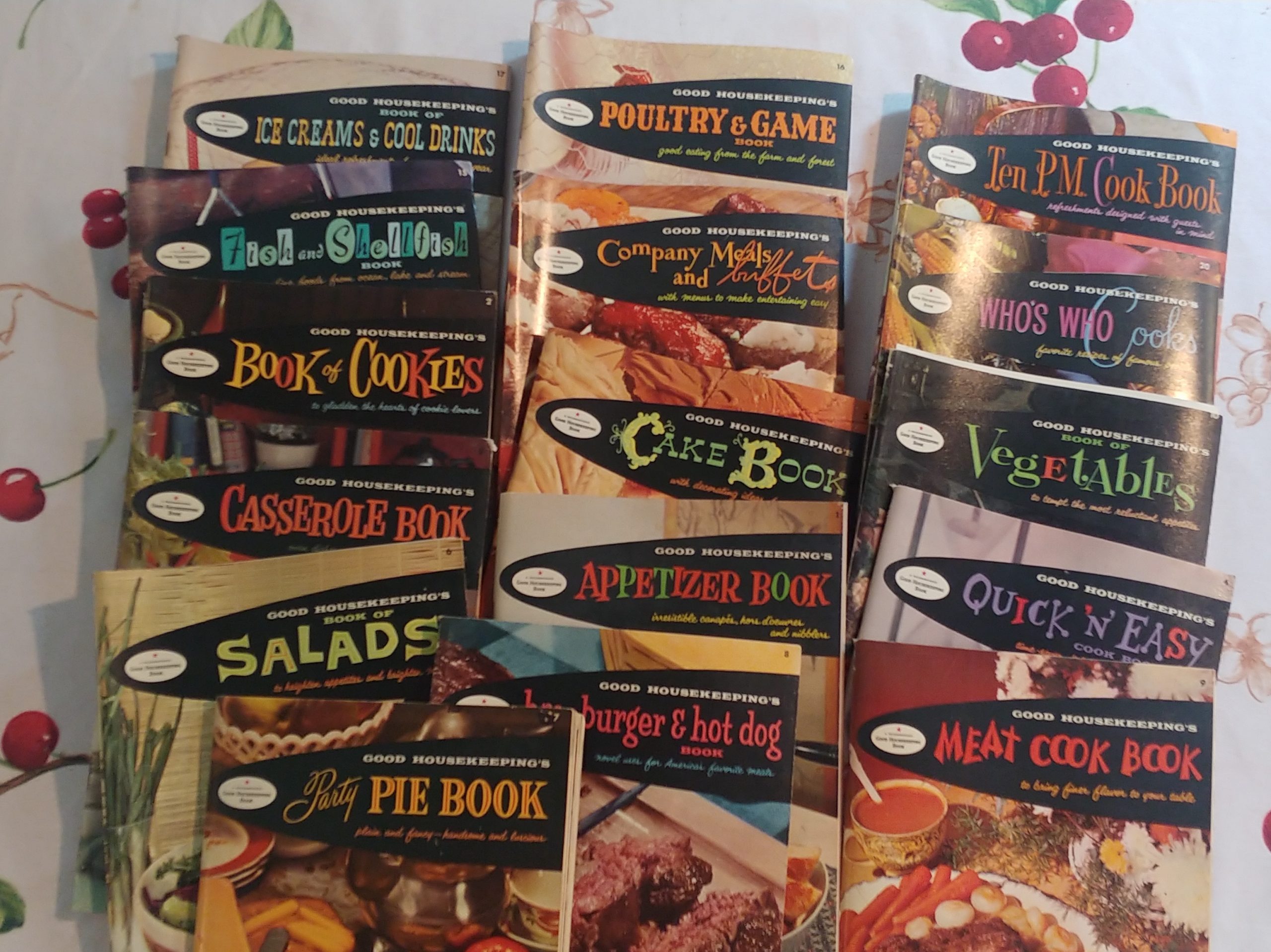
I plan on scanning them all in, and I cannot wait to do that.
I am also a sucker for catalogs from the 50s and 60s, as they provide great eye candy about the stuff I could have bought “back in the day.” I ran across a 1963 Hilex catalog that was in perfect condition:

The cover alone deserves to be analyzed. What exactly is behind that frozen smile on mom’s face? She is either totally in love with dad or ready to poison his coffee.
Inside the catalog, goodness abounds:
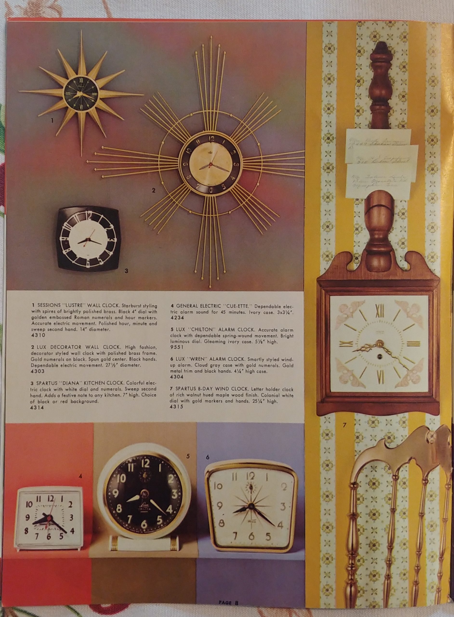
I plan on scanning that one in too. And I want ALL those clocks at the top.
I ran across a little 1959 Christmas Cookie cookbook sponsored by Wisconsin Electric Power Co. The cover alone made me want to buy it, but inside are lots of cute graphics and ads, like this one starring Reddy Kilowatt:

And, yes, I plan on scanning in that book too. (I might have a bit of a scanning addiction. Is there a group for that?)
Finally, although I have kind of eased up on Pyrex collecting because of outrageous prices, I still like looking for bakeware, and sometimes I run across a gem that is reasonably priced. Behold, a Fire King divided casserole dish, with candle warmers – original box and material inside.


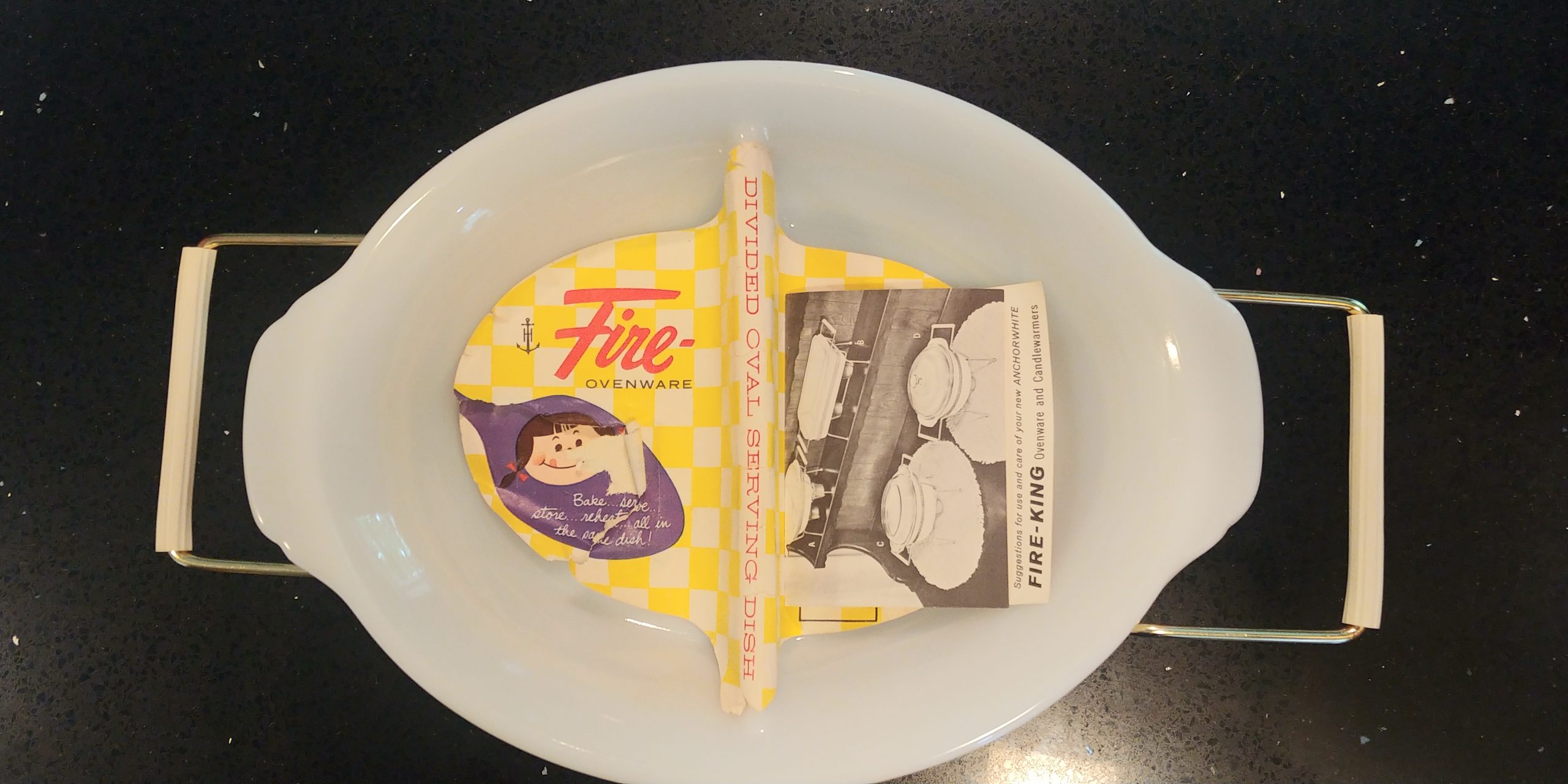
The tag claimed it was “unused,” but the melted candle wax in the warmers suggests differently. Then again, the wax could have melted while being stored somewhere warm. Who knows. All I know is that $28 was a steal for something like this. Those are the prices I am used to paying for bakeware; none of that $250 nonsense that I’m seeing in a lot of antique stores for Pyrex pieces. I mean, people are selling the turquoise starburst casserole dish by Pyrex for $800 and higher. That is simply stupid.
Anyway, I know that my “to be scanned” pile is reaching ridiculous heights. I still need to finish up my postcard project that I started during the leisurely months of summer. I only have, oh, a few hundred left to go. Maybe I’ll use this Saturday to get that cleared off my plate before I start something new.
Have a fantastic weekend!
I started collecting tablecloths about ten years ago after I decided to sell some that were just sitting in storage; they were not the right size for my table and were colors that I really didn’t like. I know now that I sold them way too cheaply, but I had no idea then that tablecloths were as collectible as they were. The swift sale of those cloths intrigued me, and I began looking for them when I went to antique stores and hunting for them online. I learned the good brands, what made a tablecloth particularly collectible, and how to remove stains.
Continue reading “Going on a bender – with tablecloths”Well, this “stay at home” stuff is an introvert’s dream, but even introverts hit a wall, and I think I’m getting there. I mean, it would be one thing if the weather was consistently nice and I could get outside of this small house to get some exercise. I did – for a few days. I got all the remaining leaves out of my yard and burned them. I got my pond up and running, which is probably the earliest I’ve ever had it cleaned out and functional. But then Mother Nature decided to play a little joke on us for Easter Sunday, and this is what the pond looks like today.
Continue reading “An Easter to remember”NOTE: During a recent software update, the pics from this post somehow disappeared. In fact, I must have deleted them off my computer, too, because they are nowhere to be found. I am going to try to retake these photos and fix this post. In the meantime, please know that this post will be restored soon. 🙂
*********************
I started paging through the bound collection of 1950 House Beautiful magazines that I have lying around here and I started noticing the striking difference — and amazing sameness — of the ads that appear in the magazines then and now. I happened to have some new issues in my massive “someday-I’ll-get-the-chance-to-read-these” pile and I started to contrast what the two years’ issues reveal about us as a society.
Some things never change. Cars will always be the full-page eye candy of the magazines. Although our ads today tend to emphasize more environmentally-friendly features, there are still some common threads. We still want Cadillacs to reveal that yes, we are just a tad bit more successful than the average Joe ….

And we still expect our Toyotas to have a little more zip. (Yes, I know Toyotas didn’t exist in 1950. Play along, will you?)

We still want faucets, toilets, bathtubs, and showers to convey that we have great taste:

But in 1950, even having good choice in a toilet seat alone was a priority. (When’s the last time you’ve seen an ad for toilet seats?)

Beauty and staying young was important to women in 1950. They even took a risk and invested in rather scary contraptions like this all in the name of youth:

Today, rather than having these little ads make up the tiny little ads in the back of the magazine, we get to see full-page ads of Botox-injected, plastic-surgery laden, professionally hairstyled celebrities pretend like they actually use these products to look the way they do.

Call me jaded if you will, but I’m pretty certain Courtney Cox’s hair has never been drenched with any Pantene product. Just a hunch.
In House Beautiful, paint ads in 1950 were full-page and usually in color:

Some things never change:

In 1950, people seemed to be on a constant quest for the perfect, most comfortable mattress. These ads usually were full-page as well:

Our aching backs were definitely an issue back in the day. We wanted something orthopedic … something that would make us sleep like a baby … yet something that was stylish. Behold, 2013:

I made this one larger so you could see the text: “made from certified natural materials.” There’s that environmentalism again.
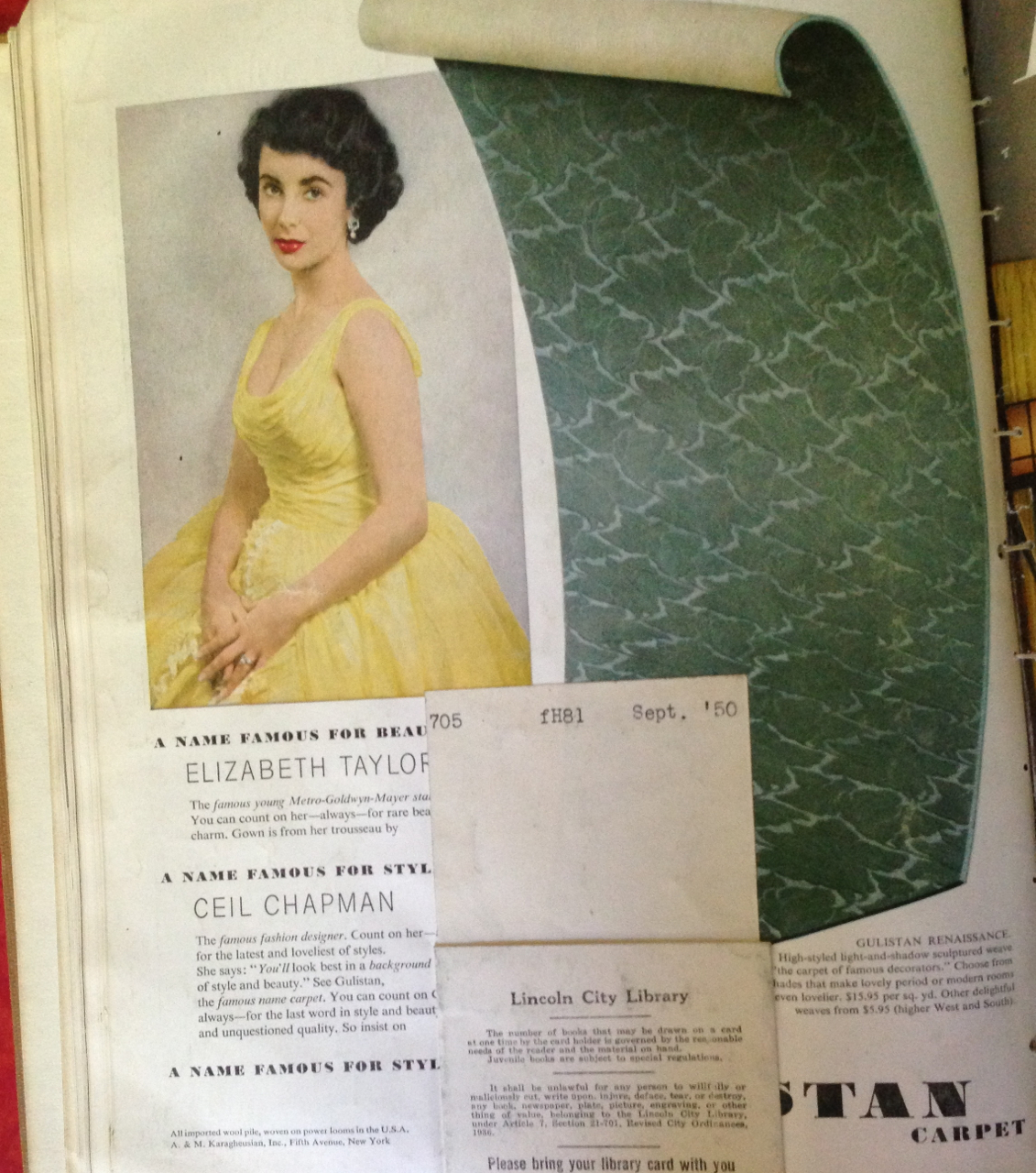
In 1950, Liz Taylor graced the back cover of the magazine, touting the luxurious carpet that Gulistan had to offer:
And now? AllState Insurance graces the back cover, presumably trying to convince you that once your house is House Beautiful, you need to sign up with them to protect all that beauty.

Here are a couple ads that you just don’t see anymore in modern magazines:

I swear I’m not trying to be repetitive, because I know I’ve pointed out before how you just don’t see ads for candles in modern magazines, but I guess I was struck by how many candle ads I saw in the 1950 issues. Today? Zero. Back in 1950, we could also get away with copious ads for:

What would Mad Men be without the liquor? Today it seems that liquor ads are becoming more frowned-upon. I figure in a few years the liquor companies will suffer the same scorn as the tobacco industry and ads for booze will not exist.
There were a few ads in the 2013 issues of House Beautiful that you just didn’t see in 1950 and definitely reflect our changing values, especially in where our money goes. Behold the annoying, multi-page ads for the latest prescription drugs:

Two pages of ad space for this drug? Show me the money!
While Americans certainly had debt in 1950, it wasn’t as easy to get into debt as whipping out a little plastic card and sliding it through a machine in the name of keeping up with the Joneses.

The text for this ad is interesting: no late fees, no penalty rates, because there are plenty of other things to stress over.
Yeah — how about the DEBT that people are incurring on their credit cards for crap they don’t need? That’s probably the most stressful thing of all. Now go sit in a corner, Citibank, and count your millions.
Lastly, while many people had pets in 1950 and most certainly loved them as much as we do ours today, we definitely show them love them with food a lot more than we used to. In 1950 there were virtually no ads for pet food, kitty litter, or anything else. Now? They’ve got the bucks to take out those full-page ads:

Oh, and friend them on Facebook. It’s how we roll in 2013.
Yep, I’m aware that I haven’t written for two months. That little nagging voice in the back of my head wouldn’t let me forget it. As much as I would love to be disciplined enough to be a daily (or at least multi-week) blogger, I had to accept long ago that it just wasn’t going to happen. Something had to give, y’know? And the truth is, I’m not that interesting. I run out of things to talk about. I don’t have time to scour the internet for interesting things, even the things I love to talk about. During the school year, the majority of my time is spent on school and kids and all the chaos that goes along with school and kids. When I’m not dealing with the chaos of school and kids, I’m enjoying a leisurely bath. Like I said, something had to give, and I wasn’t going to give up my baths. After all … blogging while in the bath might prove to be a bit, ah, dangerous.
My part of Iowa is currently under a Winter Storm Warning. The Weather Channel has named this one Saturn. Their storm-naming trend has me chuckling in a way; having lived in the Midwest all my life, I know that winter storms are anything but an oddity in these parts. They happen pretty regularly, whether it involves snow, ice, or a mixture. The Weather Channel has already come up with some awesome names this year — Thor, Gandolph, etc. — but I know that eventually they’re going to run out of cool names and they’ll be relegated to normal names like Bob and Frank and Sharon. In fact, giving winter storms these comic book-like names suggests that their appearance is an oddity; a supernatural event that deserves a grand name. In reality, it’s snow. We get it all the time here in the Midwest. The last three Christmases have involved blizzards. Snow is about as odd as seeing a cornfield as I drive down the highway.
But hey — Winter Storm Saturn is here and I’m sure it will run circles around the other storms (punny, I know). Having just enjoyed a snow day last week, I think I’ll take another. Keep ’em coming until spring break, and then I’ll burst into tears because I realize that we’ll be going to school until July.
Not much happening in the Retro Find department, I hate to say. My youngest son and I stopped by the local antique store a couple weeks ago. I brought him in there last year but got the feeling that he was not very impressed. This year, I tried again, and I think I’ve made a little convert out of my 8-year old. He eagerly went into the store with me and started puttering around, picking up this and that and asking me questions about the items he found. I quickly discovered the value of having a short 8-year old in the store with me; whatever I could not see of the stacks of stuff piled under the tables, my son was sure to see something cool. He found three little framed pictures with frames made in Italy; the pictures are nondescript but the frames were charming. He found two matching ones and then pulled out another one with a different frame pattern, but the three went together so well that we bought them all. He found a hotel bell that he begged me to have, and wanting to encourage his treasure hunt, I obliged, knowing that I would be sentencing myself to weeks and months of hearing DING! repeated constantly. However, I drew the line at the “dogs playing poker” tapestry. He thought it was cool, and I …. did not. I did find a neat little wall-hanging lamp that has a total Art Deco metal edging on it. I bought it thinking that I could hang it over my bed as a reading lamp — forgetting, of course, that my bed has a WINDOW above it. So the lamp got stashed on a shelf until I can find a suitable place for it.
Needless to say, I think I’ve converted my youngest son into an antique hunter. My oldest son, however, still rolls his eyes and says, “Mom, why do you have to fill our house with 50’s stuff? Why can’t we have NICE stuff?”
Someday, I hope he realizes that those things mean the same thing. 🙂
Despite all the hype that we’ve had to listen to for the past two years (at least), there was no apocalypse; no massive power outages; no need to buy wind-up radios and generators. Don’t get me wrong — I didn’t do any of those last things. I tended to believe that if people were able to exist before electricity, then we’d figure it out now too. I’m also not a “prepper,” as if there were a major catastrophe on earth and life was absolutely miserable, why in the world would I want to stick around? But hey … we’re all still here and now the History Channel will have to dig up some more experts who will be freely sharing their other theories about how the world will end. Personally, I think there’s a lot of danger in media hyping end-of-the-world scenarios to a young generation of kids who already don’t really believe that they have a lot to live for. But that’s just me.
It’s been a great Christmas break and I am trying hard to ignore the fact that school has started back up. Back to the grind. Back to the chaos. Good-bye, leisurely mornings drinking coffee and puttering around. Goodbye to making lunches for the kids and taking the dog for long walks. Goodbye, sanity.
Ok, so perhaps I’ll hold onto my sanity for a little bit longer. Time will tell.
This Christmas was a good one. Despite being a drought, we received a 6″ snowfall just before break commenced. I packed up the kids, the dog, and all the presents and headed to South Dakota for a week-long stay. I was able to spend quality time with my family, along with time with my boyfriend and a great friend from my high school days. The recent snowstorm made for some pretty walks with the dogs in the morning, and a layer of frost over the landscape on the 29th helped me capture some nice shots.
I did get some great retro treasures for Christmas. The man in my life found the perfect things for my house; it’s evident how well he knows me. The evidence:

A star-adorned magazine rack that looks right at home in my 1953 house …..

… a pink and gray Zenith radio that is so many kinds of awesome that I just love to look at it. Oh, and it works! ….

A Seth Thomas clock! Oh, how beautiful it is ….
I hope everyone had a wonderful Christmas and New Year’s.
A few weeks ago I wrote a post regarding some starburst flatware that I had picked up in various stores and my quest to identify the wide variety of patterns I encountered. Read the original post here. As I described in that post, what I thought would be an easy task turned into a frustrating series of dead-ends as I tried to match up the plethora of patterns to definite names.
Then I received a most helpful email on Etsy from a fellow Etsyer named Wardrobecat. She took the time to correct my futile attempt to identify the pieces and provided oodles of great information. Here is her email here:
Hi,
I just ran across your website that had a post dated 7-18-12 talking about your recent purchase of many different styles of flatware similar to Mar-crest “Citation”.
I happen to own a full service for 24 of this pattern, as well as having many new-in-box samples of it. Yes, I realize that I have gone a bit overboard in buying this stuff, but I just love it. I use one set of 12 for everyday use and keep another set of 12 in storage for when I have guests. Many of my pieces are nearly mint. Many I have found in thrift stores for 10-29 cents a piece, and others I must admit that I have paid a lot on E-Bay and Craig’s List.
So anyway, the true Marcrest Citation piece in your photo is the one on the far left. It should be marked “stainless steel USA” near the base of the blade. It will not show the word Mar-crest. Every other type of utensil made in this pattern will have the words “Mar-crest stainless steel USA”, but for some reason the knife does not have the word Mar-crest.
This pattern was made in the following pieces: dinner knife, dinner fork, dessert spoon, teaspoon, salad fork, round bowl soup spoon, iced drink spoon, grapefruit spoon, serving spoon, cold meat fork, butter knife, sugar spoon, seafood fork, cocktail sauce spoon and pie server.
The knife that you thought was the real one, second from the right in your photo, I am fairly sure is a pattern called “Starette”, made by the National Stainless Company in Japan, which is often marked as “NSCo”. If it has the word Japan, it definitely is not Marcrest (Marcrest will always show “USA”).
I hope this helps you weed out the many variations of similar styles made by different companies. Good luck finding pieces to add to your collection!
and a later email …..
Here is some more info, just to add to the multitude of starburst designs!
The Mar-Crest pattern that you like is called “Citation Futuristic”. There are two additional patterns made by Mar-Crest that are called simply “Citation”. All three feature different starburst designs. The Futuristic pattern has three stars on a wavy handle; Citation variation 1 (often called MCF-1 by online consumers) has five large stars on a tapered handle with a rounded tip; Citation variation 2 (often called MCF-2) has three small stars and four swirling lines on a relatively straight handle that has a slightly square/round tip. I have included a photo showing all three together.
Sorry it is not a better photo, I tried several times and kept getting glare spots. This is my original photo taken on 8-26-12, and you may use it if you wish.
Cheers!

Needless to say, I am eternally grateful to Wardrobecat for the helpful information! I look forward to adding more pieces to my collection and seeing which one is truly my favorite, as it seems to vary each time I set a table with them.
My dad did it again — he scored a bound collection of 1953 House Beautiful magazines from Lincoln, Nebraska. I think all my bound collections that I’ve gotten from him have been from Lincoln; since I was born there, that’s kind of neat.
Anyway … I am heading out of town this weekend for the last hurrah before the school year begins; this time it is a mom and sis weekend in Pepin, Wisconsin. A little sun, a little eating, a little relaxation — all of it needed before the chaos of school begins again.
First up, let me present you with an ultra cool and modern view of a kitchen:

Oh, what I wouldn’t give to have counterspace like this. I figure this kitchen can serve a dual purpose: when it’s not in culinary use, it doubles as a place for family 50-yard dash races. I think if you called “Hello?” at this end, you’d hear an echo for sure.
My last post was about products you just don’t see anymore in today’s magazines. I found a couple of doozies in this collection.

The idea of a squeezable flask is a little surprising to me, probably because I’ve never used a flask and can’t imagine a situation where I’d actually want or need one. Just remember — this is “fine for the glove compartment.” Wow.
There’s nothing really funny or unusual about this next ad ….

… except that it’s for candles. When is the last time you’ve seen an ad for taper candles? That there’s a bygone era, I tell you. The Twistolites look nice, though. They really would make me feel special — just like the ad says!
Next up: are you wondering how to get your mother-in-law to hate you for good? Buy her some of these.

Just think of how delighted your mother-in-law would be when she peruses through a magazine and sees that you got her some earrings that were meant to alert people to a “snoopy old squaw.” Yikes.
And as long as you have cultivated hate from your mother-in-law, you might as well go the extra mile and get these for your spouse:

Seriously … sometimes there are no words.
After you’ve taken a few sips from your glove compartment flask on the way home from work and are feeling a little chatty, this next little invention should suit you juuuuust fine.

Was there ever shame in being a chain smoker? Apparently not. Let’s enable it!
That’s all for now … heading out of the Land of Corn in about two hours. Have a great weekend!
My dad (who always has a bead on some old bound magazine collections on eBay) recently snagged a bound collection of 1950 House Beautiful magazines. Oh, it is so much fun to go through these — not only to see all the style elements that I love about the architecture and design from this time period — but it is also fun to see some old products and ads that just don’t exist anymore. Some of the products are funny because they were considered rather taboo and the carefully-worded text is designed not to offend the most delicate sensibilities. Some of the ads are just downright inappropriate because it’s not even trying to hide the racism behind them.
Case in point:

There’s just no way that you can call something “Sonny Boy” and make a “bank” like this without it being totally racist. I do, however, wonder how scary the clown bank looked. Hello, nightmares!

What the …. ? What IS this? How is it a good luck charm? How will I be able to sleep without those scary jeweled eyes invading my dreams? Egads!
Over time copywriters have learned that there are just certain words and terms that you don’t put into a headline together unless you want people to look twice. Back in 1950, however, this made perfect sense:

When they weren’t coaxing readers to find “gay pick-up gifts for men,” the 1957 Sears catalog was then anxious to make women feel shameful about their natural body functions. Be dainty! Get one of these!

Sears catalogs are quite a hoot, mainly for the vast array of things that they offered via their catalog that you just don’t see anymore.

More to come as I continue to peruse these catalogs and magazines. Summer’s almost over and I’m working on getting all my traveling in so that I can pretend that school isn’t starting back up again.
(It’s not working very well.)
